
Getting Started
Welcome! Follow the instructions below to learn how to capture data, get structured insights, and answer business questions with Sticklight. // Fancy platform screenshot here1
Generate a Sticklight API key
- Login to the Sticklight platform.
- Navigate to API Keys settings and click “Generate New Key”. Give the key a descriptive name, and store it securely.
2
Use our SDKs to capture runtime data
Choose the SDK that matches your tech stack:
Python SDK
Python SDK
Install and use our Python SDK to capture events from Python applications. See the Python SDK guide.
TypeScript SDK
TypeScript SDK
Install and use our TypeScript SDK to capture events from JavaScript/TypeScript applications. See the TypeScript SDK guide.
3
Interact with your data in Views
Views are vantage points over your captured data. They are specialized tables with exploration tools for resolving key product questions.
- In the Sticklight Platform, navigate to Views
- Extract structured insights from your data by creating Properties
4
Create your first Property
Properties enrich your data for deeper understanding. Sticklight offers two types of Properties:
Calculated Properties
Calculated Properties
Calculated Properties process and aggregate any aspect of your data, including other Properties you have created.
- From your View, click “New Column” and select “Calculated”
- Name your property (e.g., “first_conversation_message”)
- Select the Source Column you wish to analyze (e.g., “message_content”)
- Select an Aggregation Function to apply to the Source Column (e.g., “First Value”)
- Optionally, define a filter to focus the calculation on a part of your data. In our example, we’ll filter to only include messages in conversations that have more than 4 messages.
- Click “Create” to save your Property
Magic Properties
Magic Properties
Magic Properties leverage natural language and LLMs to create insightful new Properties.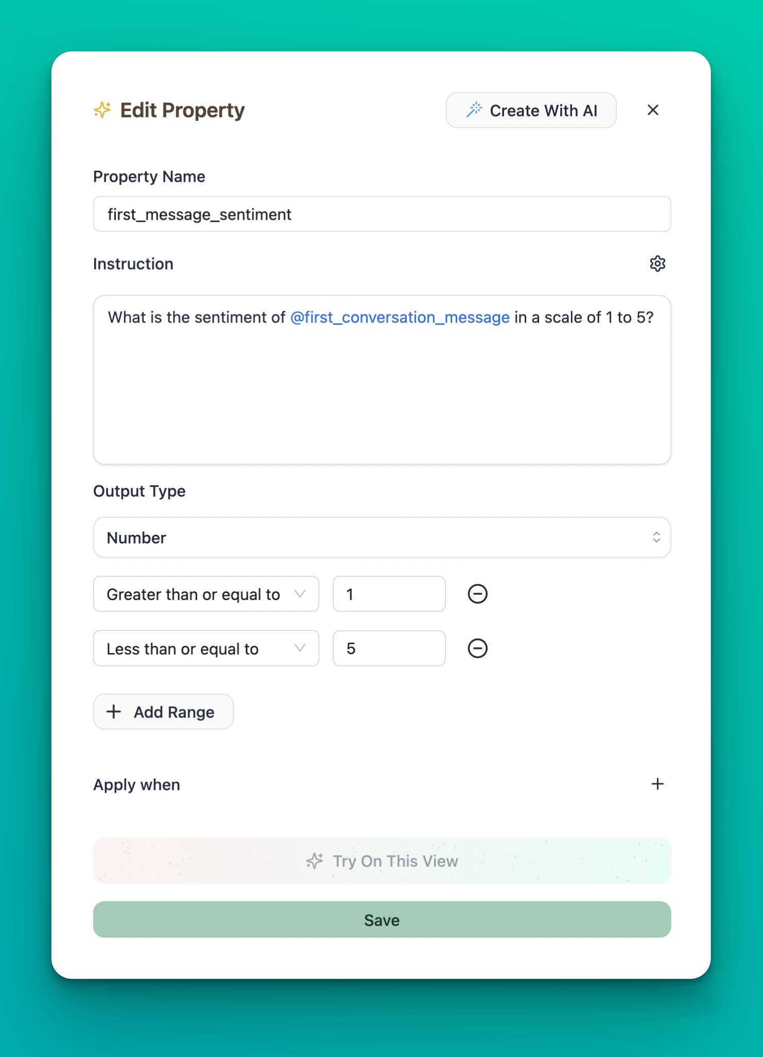 Magic Properties are powerful for extracting subjective, complex insights without having to think in SQL.
- From your View, click “New Column” and select “Magic”
-
Describe what you want to discover using natural language with column references:
- Choose the output type (“Number”, in this case)
- Name your property (e.g., “first_message_sentiment”) and click “Save”
5
Create your first Chart
// The text below is LLM generatedCharts transform your View data into visual representations that reveal patterns and trends:
- Navigate to the Charts section and click “Create Chart”
- Select the View you want to visualize
- Choose a chart type (line, bar, etc.) based on what you want to analyze
-
Configure the axes and series:
- X-axis: Time or a categorical property
- Y-axis: A numeric property or count
- Series: Optional grouping by a categorical property
- Add filters to focus on specific data segments if needed
- Name your chart and click “Create”